Plotting Utilities
fusionlab-learn provides a suite of convenient plotting utilities
designed to help you visualize model performance and results with
minimal effort. These functions are built on top of Matplotlib and
are tailored to work seamlessly with the outputs of Keras models and
the specialized models within the library.
This guide covers the primary utilities for plotting training history and visualizing the outputs of physics-informed models.
Training History Visualization (plot_history_in)
- API Reference:
plot_history_in()
After training a model, the first step is always to inspect its
learning curves. The plot_history_in function is a flexible
tool for visualizing the training and validation metrics (e.g., loss,
MAE, accuracy) recorded in a Keras History object. This is
essential for diagnosing model convergence, identifying overfitting,
and comparing the performance of different model components.
Key Parameters Explained
history: This is the primary input, which is the object returned by the
model.fit()method. It contains the metric values for each epoch.metrics: A dictionary that gives you fine-grained control over which metrics to plot and how to group them. The dictionary keys become the titles for subplots, and the values are lists of metric names from the history object. If you don’t provide this, the function will intelligently plot all available metrics.
layout: This string argument controls the overall structure of the figure.
Use
'subplots'(the default) to give each metric group its own dedicated plot. This is ideal for a clear, detailed view of each metric.Use
'single'to plot all specified metric curves on a single set of axes. This is very useful for comparing the trends of different loss components together, such as for a PINN with data loss and physics loss.
Usage Examples
1. Standard Model History
This example demonstrates how to plot the loss and Mean Absolute Error
(MAE) for a standard model. The function automatically detects the
loss and mae keys and their validation counterparts
(val_loss, val_mae) and places them in separate subplots.
 1import numpy as np
 2from fusionlab.nn.models.utils import plot_history_in
 3
 4# Create a mock history object (as returned by model.fit)
 5history_data = {
 6    'loss': np.linspace(1.0, 0.2, 20),
 7    'val_loss': np.linspace(1.1, 0.3, 20),
 8    'mae': np.linspace(0.8, 0.15, 20),
 9    'val_mae': np.linspace(0.85, 0.25, 20),
10}
11
12# Plot the history with default settings (subplots)
13plot_history_in(
14    history_data,
15    title='Standard Model Training History'
16)
This will generate a figure with two subplots: “Loss” and “Mae”, each containing the training (solid line) and validation (dashed line) curves.
Expected Output:
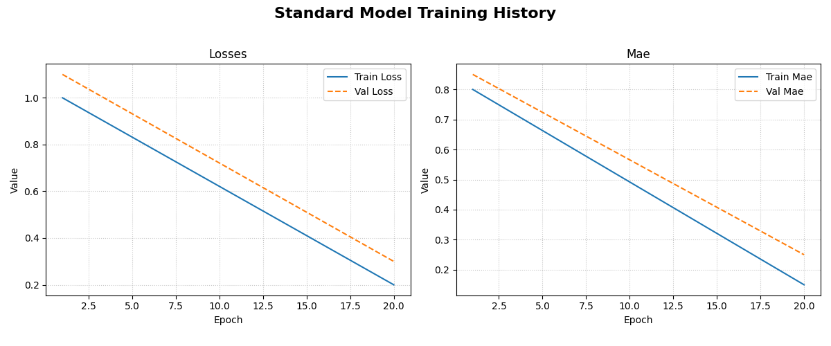
The generated figure contains two subplots. The left subplot shows the training and validation loss, while the right shows the training and validation Mean Absolute Error (MAE) over epochs.
2. Composite Loss Breakdown for a PINN
This example shows how to use layout='single' to visualize the
different loss components of a Physics-Informed Neural Network on a
single graph. This helps in understanding how each part of the loss
contributes to the total.
 1# Mock history for a model with multiple loss components
 2pinn_history = {
 3    'total_loss': np.exp(-np.arange(0, 2, 0.1)),
 4    'val_total_loss': np.exp(-np.arange(0, 2, 0.1)) * 1.1,
 5    'data_loss': np.exp(-np.arange(0, 2, 0.1)) * 0.6,
 6    'physics_loss': np.exp(-np.arange(0, 2, 0.1)) * 0.4,
 7}
 8
 9# Define which metrics to plot in one group
10pinn_metrics = {
11    "Loss Components": ["total_loss", "data_loss", "physics_loss"]
12}
13
14# Plot all loss curves on a single set of axes
15plot_history_in(
16    pinn_history,
17    metrics=pinn_metrics,
18    layout='single',
19    title='PINN Loss Breakdown'
20)
This will produce one plot titled “Loss Components”, showing the trends of the total, data, and physics losses together.
Expected Output:
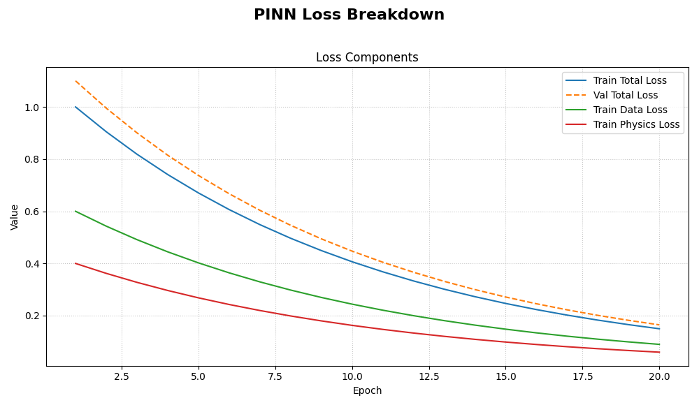
The generated plot displays all specified loss components on a single set of axes, making it easy to compare their trends and magnitudes throughout the training process.
Hydraulic Head Visualization (plot_hydraulic_head)
- API Reference:
plot_hydraulic_head()
This is a specialized utility for visualizing the output of PINNs
that solve for a 2D spatial field, such as the PiTGWFlow model.
It takes a trained model and a specific point in time, \(t\), and
generates a contour plot of the learned hydraulic head solution,
\(h(x, y)\).
Key Parameters Explained
`model`: The trained PINN model that you want to visualize. It must have a
.predict()method that accepts a dictionary of coordinates.`t_slice`: A single float value representing the time at which you want to see the spatial solution.
x_bounds, y_bounds, resolution: These parameters define the visualization domain and the quality of the plot. The function will create a grid of
resolution x resolutionpoints within these spatial bounds.`ax`: This powerful optional parameter allows you to pass a pre-existing Matplotlib
Axesobject. This is perfect for creating complex figures with multiple subplots, such as comparing the solution at different times side-by-side.
Usage Example
This example shows how to visualize the output of a mock PINN model.
In a real scenario, you would pass your trained PiTGWFlow model.
 1import tensorflow as tf
 2from fusionlab.nn.pinn.utils import plot_hydraulic_head
 3
 4# Create a mock model for demonstration purposes.
 5# This model implements a simple analytical function.
 6class MockPINN(tf.keras.Model):
 7    def call(self, inputs):
 8        t, x, y = inputs['t'], inputs['x'], inputs['y']
 9        return tf.sin(np.pi * x) * tf.cos(np.pi * y) * tf.exp(-t)
10
11mock_model = MockPINN()
12
13# --- Generate a single plot of the solution at t=0.2 ---
14plot_hydraulic_head(
15    model=mock_model,
16    t_slice=0.2,
17    x_bounds=(-1, 1),
18    y_bounds=(-1, 1),
19    resolution=80,
20    title="Hydraulic Head Solution at t=0.2"
21)
This code will generate a 2D contour plot showing the spatial distribution of the hydraulic head at the specified time.
Expected Output:
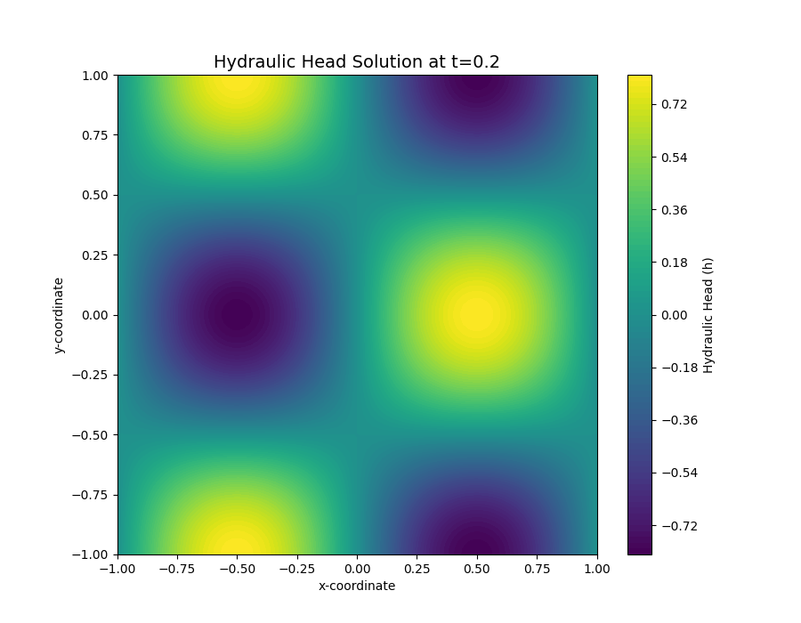
A 2D contour plot showing the spatial distribution of the hydraulic head. The color indicates the value of :math:h at each :math:(x, y) coordinate for the specified time slice.