Metrics for Forecasting Evaluation
Evaluating the performance of forecasting models is crucial for
understanding their strengths, weaknesses, and overall reliability.
fusionlab.metrics provides a comprehensive suite of metrics tailored
for various aspects of forecast evaluation, including point accuracy,
probabilistic forecast calibration and sharpness, and stability of
predictions over time.
These metrics help in:
Quantifying the accuracy of point forecasts (e.g., mean predictions).
Assessing the quality of probabilistic forecasts, such as prediction intervals and quantiles.
Comparing models against naive baselines or benchmarks.
Understanding the temporal characteristics of forecast errors.
The following sections detail the available metrics, their concepts,
mathematical formulations, and how to visualize them using utilities
from fusionlab.plot.evaluation.
Forecasting Metrics (fusionlab.metrics)
coverage_score
- API Reference:
Concept: Prediction Interval Coverage
The coverage score, also known as Prediction Interval Coverage Probability (PICP), measures the proportion of true observed values that fall within the predicted lower and upper bounds of a prediction interval. A well-calibrated model should have its empirical coverage close to the nominal coverage level of the interval. For example, a 90% prediction interval should ideally cover 90% of the true outcomes.
- Where:
\(N\) is the number of samples.
\(y_i\) is the true value for sample \(i\).
\(l_i\) and \(u_i\) are the predicted lower and upper bounds for sample \(i\).
\(\mathbf{1}\{\cdot\}\) is the indicator function.
When to Use: Use this metric when you are working with probabilistic forecasts that produce prediction intervals (defined by lower and upper quantiles, e.g., 10th and 90th percentiles). It directly tells you how often your true values are captured by the predicted range. A score significantly lower than the nominal interval (e.g., 0.7 for a 90% interval) indicates the model is too confident or its intervals are too narrow. A score much higher might indicate overly wide and less informative intervals.
Practical Example (Calculation):
 1import numpy as np
 2from fusionlab.metrics import coverage_score
 3
 4y_true_cs = np.array([10, 12, 11, 9, 15, 13, 14])
 5# Example 90% prediction interval (e.g., from q05 and q95)
 6y_lower_cs = np.array([9,  11, 10,  8, 14, 11, 13])
 7y_upper_cs = np.array([11, 13, 12, 10, 16, 15, 15])
 8
 9# Case 1: All actuals within bounds
10score_perfect_cs = coverage_score(y_true_cs, y_lower_cs, y_upper_cs, verbose=0)
11print(f"Coverage (Perfect Interval): {score_perfect_cs:.4f}")
12
13# Case 2: Some actuals outside bounds
14y_true_cs_miss = np.array([10, 13.5, 11, 7.5, 15, 16, 12]) # 2nd, 4th, 6th, 7th miss
15score_partial_cs = coverage_score(y_true_cs_miss, y_lower_cs, y_upper_cs, verbose=0)
16print(f"Coverage (Partial Interval): {score_partial_cs:.4f}")
Expected Output (Calculation):
Coverage (Perfect Interval): 1.0000
Coverage (Partial Interval): 0.4286
Visualization with `plot_coverage`:
The plot_coverage() function can
visualize these prediction intervals against the true values,
highlighting which points are covered.
 1import matplotlib.pyplot as plt
 2from fusionlab.plot.evaluation import plot_coverage
 3
 4# Using data from Case 2 above
 5# For plotting, it's often useful to have a time or sample index
 6sample_indices_cs = np.arange(len(y_true_cs_miss))
 7
 8fig_cs, ax_cs = plt.subplots(figsize=(10, 5))
 9plot_coverage(
10    y_true=y_true_cs_miss,
11    y_lower=y_lower_cs,
12    y_upper=y_upper_cs,
13    sample_indices=sample_indices_cs, # Optional x-axis values
14    title="Prediction Interval Coverage Visualization",
15    xlabel="Sample Index",
16    ylabel="Value",
17    ax=ax_cs, # Pass the created Axes object
18    verbose=0
19)
20# To save for documentation:
21# plt.savefig("docs/source/images/metric_coverage_plot.png")
22plt.show()
Expected Plot (`plot_coverage`):
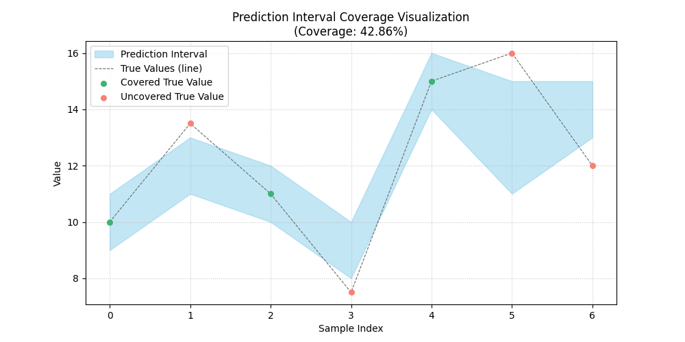
Plot showing actual values against their predicted intervals, with covered and uncovered points distinctly marked.
continuous_ranked_probability_score (CRPS)
- API Reference:
continuous_ranked_probability_score()(Note: can be aliased as `crp_score` for consistency).
Concept: Ensemble Forecast Evaluation
The Continuous Ranked Probability Score (CRPS) is a proper scoring rule that generalizes the Mean Absolute Error (MAE) to evaluate probabilistic forecasts represented by an ensemble of prediction samples (i.e., multiple possible future trajectories). It measures both the calibration (reliability) and sharpness (resolution) of the forecast distribution. Lower CRPS values indicate better forecasts.
For a single observation \(y\) and an ensemble of \(m\) forecast members \(x_1, \dots, x_m\), the sample-based CRPS is approximated as:
The first term is the average absolute error of the ensemble members to the actual value (related to accuracy). The second term is the average absolute difference between all pairs of ensemble members (related to the ensemble’s spread or sharpness). The function computes the average CRPS over all provided samples.
When to Use:
Use CRPS when your model produces an ensemble of possible future trajectories rather than quantiles or a single point forecast. It’s a comprehensive measure for evaluating the overall quality of such probabilistic forecasts. It is particularly common in meteorological and hydrological forecasting.
Practical Example (Calculation):
 1import numpy as np
 2from fusionlab.metrics import continuous_ranked_probability_score
 3
 4y_true_crps = np.array([0.5, 0.0, 1.0])
 5# Ensemble predictions: (n_samples, n_ensemble_members)
 6# For multi-step, this would be (n_samples, n_horizon_steps, n_ensemble_members)
 7# The current crp_score might expect 2D y_pred_ensemble if averaging over horizon.
 8# For this example, let's assume single-step or already aggregated over horizon.
 9y_pred_ensemble_crps = np.array([
10    [0.0, 0.2, 0.4, 0.6, 0.8],  # Ensemble for y_true = 0.5
11    [-0.2, 0.0, 0.1, 0.2, 0.3], # Ensemble for y_true = 0.0
12    [0.8, 0.9, 1.0, 1.1, 1.2]   # Ensemble for y_true = 1.0
13])
14
15score_crps = continuous_ranked_probability_score(
16    y_true_crps, y_pred_ensemble_crps, verbose=0
17    )
18print(f"Average CRPS: {score_crps:.4f}")
Expected Output (Calculation):
Average CRPS: 0.0680
Visualization with `plot_crps`:
The plot_crps() function can help
visualize the ensemble predictions against the true value for a specific
sample (using kind=’ensemble_ecdf’) or show the distribution of CRPS
scores (kind=’scores_histogram’).
 1import matplotlib.pyplot as plt
 2from fusionlab.plot.evaluation import plot_crps
 3
 4# Using data from the calculation example above
 5# Plot ECDF for the first sample
 6fig_crps1, ax_crps1 = plt.subplots(figsize=(8, 6))
 7plot_crps(
 8    y_true=y_true_crps,
 9    y_pred_ensemble=y_pred_ensemble_crps,
10    kind='ensemble_ecdf', # Plot ECDF of ensemble vs true value
11    sample_idx=0,         # Plot for the first sample
12    title=f"CRPS: Ensemble ECDF vs True Value (Sample 0)",
13    ax=ax_crps1,
14    verbose=0
15)
16# To save for documentation:
17# plt.savefig("docs/source/images/metric_crps_ecdf_plot.png")
18plt.show()
19
20# Plot histogram of CRPS scores (if crps_values are pre-calculated)
21# First, calculate CRPS for each sample individually
22all_crps_scores = []
23for i in range(len(y_true_crps)):
24    single_true = np.array([y_true_crps[i]])
25    single_ensemble = y_pred_ensemble_crps[i:i+1, :] # Keep 2D for function
26    all_crps_scores.append(
27        continuous_ranked_probability_score(single_true, single_ensemble)
28        )
29all_crps_scores = np.array(all_crps_scores)
30
31fig_crps2, ax_crps2 = plt.subplots(figsize=(8, 5))
32plot_crps(
33    y_true=y_true_crps, # Still needed for context if show_score=True
34    y_pred_ensemble=y_pred_ensemble_crps, # Not strictly needed if metric_values given
35    metric_values=all_crps_scores, # Pass pre-calculated scores
36    kind='scores_histogram',
37    title="Distribution of CRPS Scores",
38    ax=ax_crps2,
39    verbose=0
40)
41# To save for documentation:
42# plt.savefig("docs/source/images/metric_crps_histogram_plot.png")
43plt.show()
Expected Plot (`plot_crps` - ECDF):
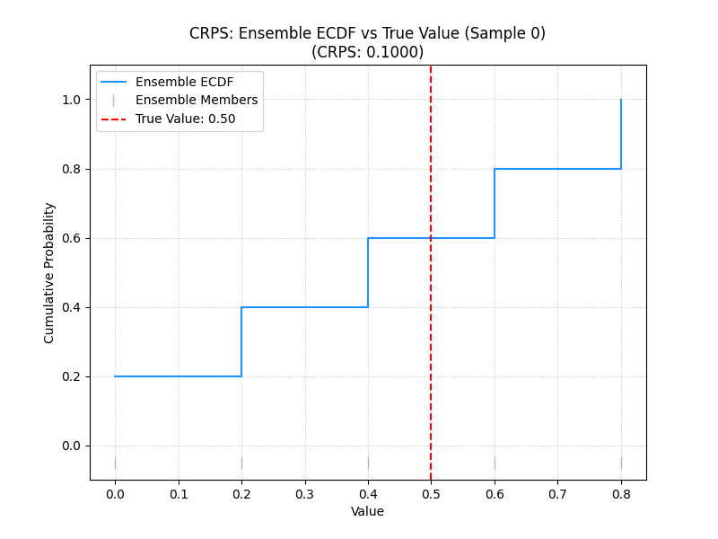
Plot showing the Empirical Cumulative Distribution Function (ECDF) of an ensemble forecast against the true observed value for a sample.
Expected Plot (`plot_crps` - Histogram):
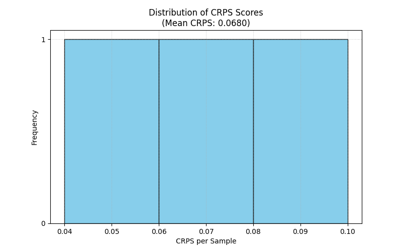
Histogram showing the distribution of CRPS scores across all samples.
mean_interval_width_score
- API Reference:
Concept: Mean Interval Width (Sharpness)
This metric, often referred to as sharpness, measures the average
width of the prediction intervals. Narrower intervals are generally
preferred, provided they maintain adequate coverage (as measured by
coverage_score()). It is calculated
independently of the true observed values.
- Where:
\(N\) is the number of samples (or sample-horizon pairs).
\(u_i\) and \(l_i\) are the upper and lower bounds of the prediction interval for sample \(i\).
When to Use:
Use this metric alongside coverage_score to evaluate probabilistic forecasts that produce prediction intervals. While high coverage is good, if the intervals are excessively wide, they may not be very useful. A good model balances high coverage with reasonably narrow (sharp) intervals. This metric helps quantify that sharpness.
Practical Example (Calculation):
1import numpy as np
2from fusionlab.metrics import mean_interval_width_score
3
4y_lower_miw = np.array([9, 11, 10, 8, 13])
5y_upper_miw = np.array([11, 13, 12, 10, 14])
6# Widths: [2, 2, 2, 2, 1]
7
8score_miw = mean_interval_width_score(y_lower_miw, y_upper_miw, verbose=0)
9print(f"Mean Interval Width: {score_miw:.4f}")
Expected Output (Calculation):
Mean Interval Width: 1.8000
Visualization with `plot_metric_over_horizon` or `plot_metric_radar`:
The Mean Interval Width can be visualized:
Over the forecast horizon: Use
plot_metric_over_horizon(). This requires calculating MIW for each forecast step.Across different segments: Use
plot_metric_radar(). This requires calculating MIW for each segment.
For a simple bar chart of the overall MIW, you can use Matplotlib directly.
 1import matplotlib.pyplot as plt
 2from fusionlab.plot.evaluation import plot_metric_over_horizon
 3from fusionlab.nn.utils import format_predictions_to_dataframe # For df structure
 4
 5# Assume y_true_val, y_lower_val, y_upper_val are (Samples, Horizon)
 6# For plot_metric_over_horizon, we need a forecast_df
 7# Let's simulate a forecast_df for this visualization
 8B, H = 5, 4 # 5 samples, 4 horizon steps
 9y_true_dummy = np.random.rand(B, H)
10y_lower_dummy = y_true_dummy - np.random.rand(B, H) * 0.5
11y_upper_dummy = y_true_dummy + np.random.rand(B, H) * 0.5
12
13# Create a dummy forecast_df (simplified)
14# In practice, use format_predictions_to_dataframe
15rows = []
16for i in range(B):
17    for h_step in range(H):
18        rows.append({
19            'sample_idx': i,
20            'forecast_step': h_step + 1,
21            'target_actual': y_true_dummy[i, h_step],
22            'target_q_lower': y_lower_dummy[i, h_step], # Example name
23            'target_q_upper': y_upper_dummy[i, h_step]  # Example name
24        })
25df_for_miw_plot = pd.DataFrame(rows)
26
27# Custom metric function for MIW to pass to plot_metric_over_horizon
28def miw_for_plot(y_true, y_pred_dict): # y_pred_dict will contain q_lower, q_upper
29    return mean_interval_width_score(
30        y_pred_dict['target_q_lower'], y_pred_dict['target_q_upper']
31        )
32
33# This requires plot_metric_over_horizon to handle y_pred_dict
34# or a more specific plot function for interval metrics.
35# For simplicity, let's plot the overall MIW as a bar.
36overall_miw = mean_interval_width_score(
37    df_for_miw_plot['target_q_lower'], df_for_miw_plot['target_q_upper']
38    )
39
40fig_miw, ax_miw = plt.subplots(figsize=(6,4))
41ax_miw.bar(['Overall MIW'], [overall_miw], color='skyblue')
42ax_miw.set_title('Mean Interval Width (Overall)')
43ax_miw.set_ylabel('Average Width')
44ax_miw.text(0, overall_miw + 0.05, f'{overall_miw:.2f}', ha='center')
45plt.grid(axis='y', linestyle='--')
46# plt.savefig("docs/source/images/metric_miw_plot.png")
47plt.show()
Expected Plot (Overall MIW Bar Chart):
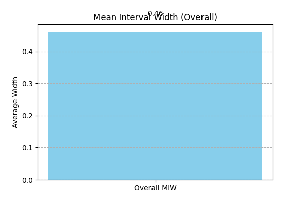
Bar chart showing the overall Mean Interval Width.
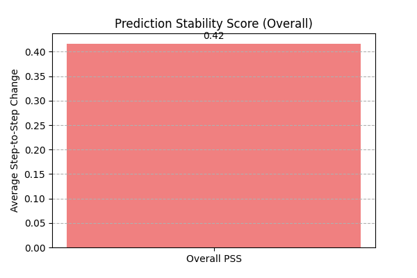
prediction_stability_score
- API Reference:
Concept: Prediction Stability Score (PSS)
PSS measures the temporal smoothness or coherence of consecutive forecasts within a prediction horizon. It quantifies the average absolute change between predictions at successive time steps. Lower values indicate smoother and more stable forecast trajectories, which can be desirable for interpretability and actionability.
For a single forecast trajectory \(\hat{y}_1, \dots, \hat{y}_T\) (where \(T\) is the horizon length):
The function averages this score over all provided samples and outputs (if multi-output).
When to Use: Use PSS to evaluate the “smoothness” or “jitteriness” of your multi-step forecasts. Highly erratic predictions over the horizon might be less trustworthy or harder to act upon, even if their average accuracy is good. This is particularly relevant for models that predict an entire sequence at once.
Practical Example (Calculation):
 1import numpy as np
 2from fusionlab.metrics import prediction_stability_score
 3
 4y_pred_pss = np.array([
 5    [1, 1.1, 1.3, 1.4, 1.6], # Smooth
 6    [2, 3,   2,   3,   2],   # Jittery
 7    [5, 4.9, 4.8, 4.7, 4.6]  # Smooth (decreasing)
 8])
 9# PSS for row 0: (|0.1|+|0.2|+|0.1|+|0.2|)/4 = 0.6/4 = 0.15
10# PSS for row 1: (|1|+|1|+|1|+|1|)/4 = 4/4 = 1.0
11# PSS for row 2: (|-0.1|+|-0.1|+|-0.1|+|-0.1|)/4 = 0.4/4 = 0.1
12# Overall PSS = (0.15 + 1.0 + 0.1) / 3 = 1.25 / 3
13
14score_pss = prediction_stability_score(y_pred_pss, verbose=0)
15print(f"PSS: {score_pss:.4f}")
Expected Output (Calculation):
PSS: 0.4167
Visualization with `plot_metric_radar` or Bar Chart:
PSS is typically a single score per item or overall. It can be
visualized using a bar chart if comparing across different models or
segments, or using plot_metric_radar()
if you have PSS calculated for different categories.
 1import matplotlib.pyplot as plt
 2
 3fig_pss, ax_pss = plt.subplots(figsize=(6,4))
 4ax_pss.bar(['Overall PSS'], [score_pss], color='lightcoral')
 5ax_pss.set_title('Prediction Stability Score (Overall)')
 6ax_pss.set_ylabel('Average Step-to-Step Change')
 7ax_pss.text(0, score_pss + 0.01, f'{score_pss:.2f}', ha='center')
 8plt.grid(axis='y', linestyle='--')
 9# plt.savefig("docs/source/images/metric_pss_plot.png")
10plt.show()
Expected Plot (Overall PSS Bar Chart):
Bar chart showing the overall Prediction Stability Score.
quantile_calibration_error
- API Reference:
Concept: Quantile Calibration Error (QCE)
QCE assesses the calibration of probabilistic forecasts given as a set of predicted quantiles. For each nominal quantile level \(q\), it measures the absolute difference between \(q\) and the empirical frequency of observations falling below the predicted \(q\)-th quantile \(\hat{Q}(q)\). A perfectly calibrated forecast would have this empirical frequency match \(q\).
The function returns the average QCE across all provided quantile levels. Lower values (closer to 0) indicate better calibration.
When to Use: Use QCE to evaluate if your model’s predicted quantiles are reliable. For example, if you predict the 0.1 quantile, you expect about 10% of the actual values to fall below this prediction. QCE quantifies how far off your model is from this ideal. It’s essential for assessing the trustworthiness of prediction intervals derived from quantiles.
Practical Example (Calculation):
 1import numpy as np
 2from fusionlab.metrics import quantile_calibration_error
 3
 4y_true_qce = np.array([1, 2, 3, 4, 5, 6, 7, 8, 9, 10])
 5quantiles_qce = np.array([0.25, 0.5, 0.75])
 6y_pred_quantiles_qce = np.array([
 7    [1.5, 4.5, 7.5], [2.0, 5.0, 8.0], [2.5, 5.5, 8.5],
 8    [3.0, 6.0, 9.0], [3.5, 6.5, 9.5], [4.0, 7.0, 10.0],
 9    [4.5, 7.5, 10.5],[5.0, 8.0, 11.0],[5.5, 8.5, 11.5],
10    [6.0, 9.0, 12.0]
11])
12score_qce = quantile_calibration_error(
13    y_true_qce, y_pred_quantiles_qce, quantiles_qce, verbose=0
14    )
15print(f"Average QCE: {score_qce:.4f}")
Expected Output (Calculation):
Average QCE: 0.2000
Visualization with `plot_quantile_calibration`:
The plot_quantile_calibration()
function creates a reliability diagram, plotting the observed
proportion of actuals below each predicted quantile against the
nominal quantile level.
 1import matplotlib.pyplot as plt
 2from fusionlab.plot.evaluation import plot_quantile_calibration
 3
 4# Using data from the calculation example above
 5fig_qce, ax_qce = plt.subplots(figsize=(7, 7))
 6plot_quantile_calibration(
 7    y_true=y_true_qce,
 8    y_pred_quantiles=y_pred_quantiles_qce,
 9    quantiles=quantiles_qce,
10    title="Quantile Calibration Reliability Diagram",
11    ax=ax_qce,
12    verbose=0
13)
14# plt.savefig("docs/source/images/metric_qce_plot.png")
15plt.show()
Expected Plot (`plot_quantile_calibration`):
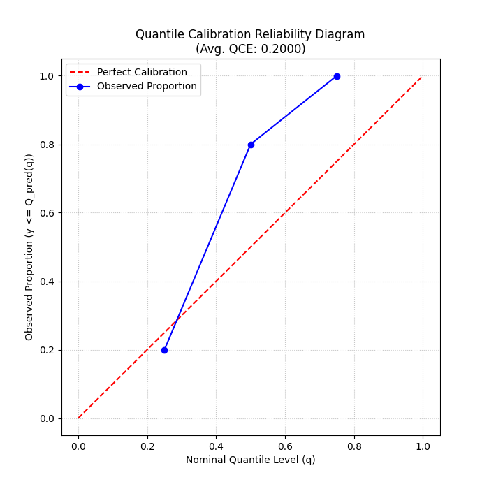
Reliability diagram showing observed vs. nominal proportions for different quantiles. Points closer to the diagonal indicate better calibration.
theils_u_score
- API Reference:
Concept: Theil’s U Statistic
Theil’s U statistic is a relative accuracy measure that compares the forecast to a naive persistence model (random walk forecast, where the forecast for the next period is the current period’s actual value). It is the ratio of the Root Mean Squared Error (RMSE) of the model’s forecast to the RMSE of the naive forecast.
Where sums are over valid samples \(i\), outputs \(o\), and time steps \(t \ge 2\) (or \(t \ge \text{lag}+1\) if a different lag is used for the naive model).
\(U < 1\): Forecast is better than the naive model.
\(U = 1\): Forecast is as good as the naive model.
\(U > 1\): Forecast is worse than the naive model.
When to Use:
Use Theil’s U to understand if your sophisticated forecasting model is actually providing more value than a very simple baseline (like predicting the last known value). It’s a good sanity check, especially for time series that exhibit strong persistence. A U score greater than 1 is a strong indication that the model needs improvement or is not suitable for the data.
Practical Example (Calculation):
1import numpy as np
2from fusionlab.metrics import theils_u_score
3
4# 2 samples, 4-step horizon, 1 output dim
5y_true_u = np.array([[1,2,3,4],[2,2,2,2]])
6y_pred_u = np.array([[1,2,3,5],[2,1,2,3]])
7
8score_u = theils_u_score(y_true_u, y_pred_u, verbose=0)
9print(f"Theil's U: {score_u:.4f}")
Expected Output (Calculation):
Theil's U: 1.0000
Visualization with `plot_theils_u_score`:
The plot_theils_u_score() function
can display Theil’s U as a bar chart, often with a reference line at 1.0.
 1import matplotlib.pyplot as plt
 2from fusionlab.plot.evaluation import plot_theils_u_score
 3
 4# Using data from the calculation example above
 5fig_u, ax_u = plt.subplots(figsize=(6, 5))
 6plot_theils_u_score(
 7    y_true=y_true_u, # Required if metric_values is None
 8    y_pred=y_pred_u, # Required if metric_values is None
 9    # metric_values=score_u, # Can pass pre-calculated score
10    title="Theil's U Statistic Example",
11    ax=ax_u,
12    verbose=0
13)
14# plt.savefig("docs/source/images/metric_theils_u_plot.png")
15plt.show()
Expected Plot (`plot_theils_u_score`):
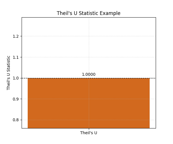
Bar chart showing Theil’s U statistic, with a reference line at 1.0.
time_weighted_accuracy_score
- API Reference:
Concept: Time-Weighted Accuracy (TWA) Score
TWA evaluates classification accuracy over sequences, applying time-dependent weights. This is useful when the importance of correct predictions varies across the time horizon (e.g., earlier predictions in a sequence might be more critical).
For a single sample \(i\), output \(o\), the TWA is: .. math:
\mathrm{TWA}_{io} = \sum_{t=1}^{T_{steps}} w_t \cdot
\mathbf{1}\{y_{i,o,t} = \hat{y}_{i,o,t}\}
Where \(w_t\) are normalized time weights (summing to 1 over the horizon). The final score is an average over samples and possibly outputs. Higher scores (closer to 1) are better.
When to Use: Use this metric for evaluating sequential classification tasks where the accuracy at different time steps within the sequence has varying importance. For example, in predicting a sequence of states, correctly predicting the initial states might be more valuable.
Practical Example (Calculation):
 1import numpy as np
 2from fusionlab.metrics import time_weighted_accuracy_score as twa_score
 3
 4y_true_twa = np.array([[1, 0, 1], [0, 1, 1]]) # 2 samples, 3 timesteps
 5y_pred_twa = np.array([[1, 1, 1], [0, 1, 0]])
 6
 7score_default_twa = twa_score(y_true_twa, y_pred_twa, verbose=0)
 8print(f"TWA (default 'inverse_time' weights): {score_default_twa:.4f}")
 9
10custom_weights_twa = np.array([0.6, 0.3, 0.1]) # Must sum to 1
11score_custom_twa = twa_score(
12    y_true_twa, y_pred_twa, time_weights=custom_weights_twa, verbose=0
13    )
14print(f"TWA (custom weights [0.6, 0.3, 0.1]): {score_custom_twa:.4f}")
Expected Output (Calculation):
TWA (default 'inverse_time' weights): 0.7727
TWA (custom weights [0.6, 0.3, 0.1]): 0.8000
Visualization with `plot_time_weighted_metric`:
The plot_time_weighted_metric()
function can visualize how the accuracy (or its components) and weights
evolve over the time steps.
 1import matplotlib.pyplot as plt
 2from fusionlab.plot.evaluation import plot_time_weighted_metric
 3
 4# Using data from the calculation example above
 5fig_twa, ax_twa = plt.subplots(figsize=(10, 5))
 6plot_time_weighted_metric(
 7    metric_type='accuracy', # Specify the metric
 8    y_true=y_true_twa,
 9    y_pred=y_pred_twa,
10    time_weights='inverse_time', # Can also pass custom_weights_twa
11    kind='time_profile', # Show accuracy profile over time steps
12    title="Time-Weighted Accuracy Profile",
13    ax=ax_twa,
14    verbose=0
15)
16# To save for documentation:
17# plt.savefig("docs/source/images/metric_twa_plot.png")
18plt.show()
Expected Plot (`plot_time_weighted_metric` for TWA):
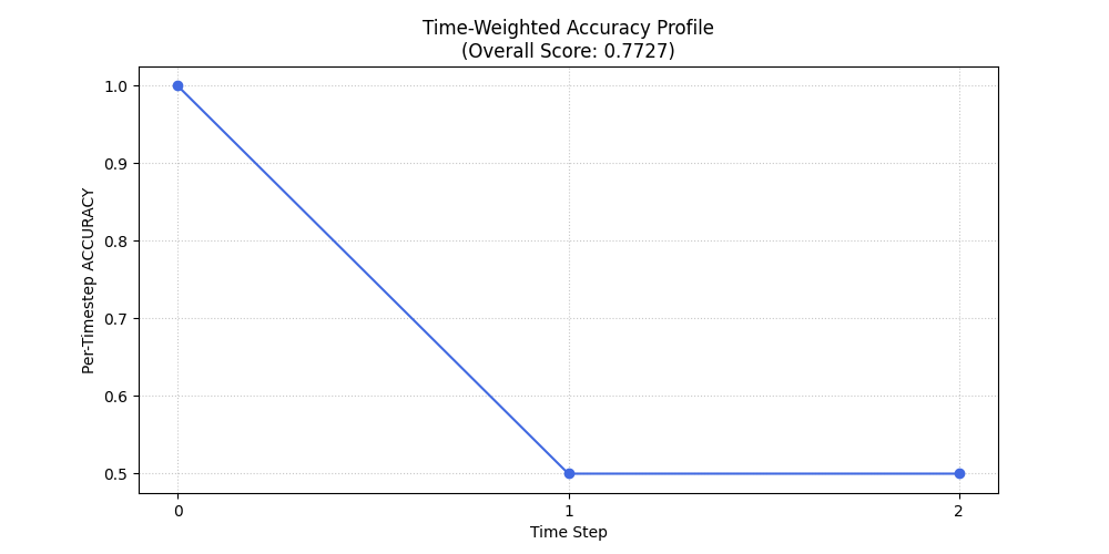
Plot showing the accuracy at each time step along with the time weights applied.
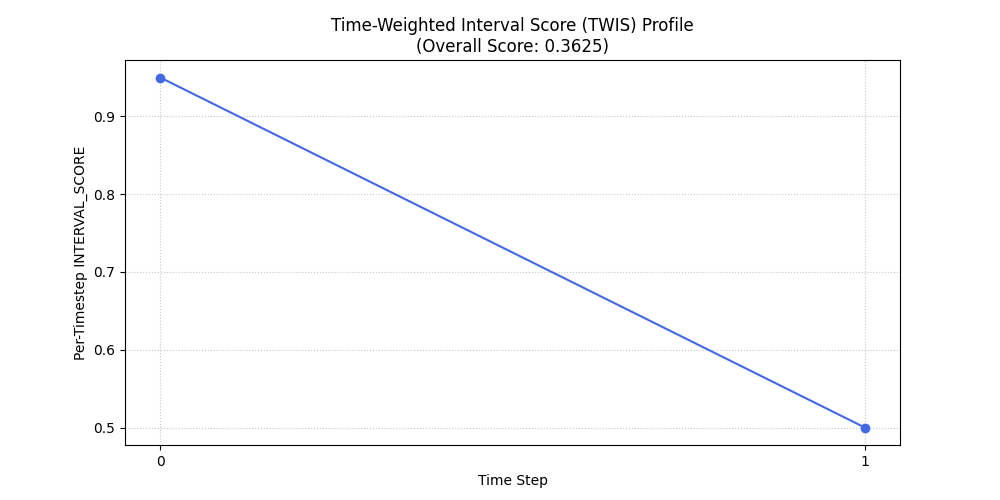
time_weighted_interval_score
- API Reference:
Concept: Time-Weighted Interval Score (TWIS)
TWIS extends the Weighted Interval Score (WIS) by applying time-dependent weights to the WIS calculated at each time step. It evaluates probabilistic forecasts (median and prediction intervals) over a time horizon, emphasizing performance at certain horizons. WIS itself considers both sharpness (interval width) and calibration (coverage of multiple intervals). Lower scores are better.
The WIS for a single observation \(y\), median \(m\), and \(K\) prediction intervals (defined by lower bounds \(l_k\) and upper bounds \(u_k\) with nominal coverages \(1-\alpha_k\)) is:
(Note: The original formula in the prompt had \(K+1\) in the denominator and different weighting for IS. The formula above is a common representation. The exact formula used by fusionlab.metrics.weighted_interval_score should be checked for precise interpretation.)
TWIS then calculates \(\mathrm{WIS}_{iot}\) for each sample \(i\), output \(o\), and time step \(t\), and applies time weights:
Where \(w_t\) are normalized time weights.
When to Use: Use TWIS when evaluating multi-step probabilistic forecasts that provide a median and multiple prediction intervals (defined by quantiles), and when the importance of forecast quality varies across the forecast horizon. It provides a single score summarizing both calibration and sharpness, weighted by time.
Practical Example (Calculation):
 1import numpy as np
 2from fusionlab.metrics import time_weighted_interval_score
 3
 4# 2 samples, 1 output (implicit in y_true shape), 2 timesteps
 5y_true_twis = np.array([[10, 11], [20, 22]])
 6y_median_twis = np.array([[10, 11.5], [19, 21.5]])
 7# For K=1 interval, alpha=0.2 (80% PI)
 8alphas_twis = np.array([0.2])
 9# y_lower/upper shape: (n_samples, n_outputs_dummy=1, K_intervals=1, n_timesteps)
10# The function expects (n_samples, K_intervals, n_timesteps)
11y_lower_twis = np.array([[[9, 10]], [[18, 20]]]) # (2, 1, 2)
12y_upper_twis = np.array([[[11, 12]], [[20, 23]]])# (2, 1, 2)
13
14score_twis = time_weighted_interval_score(
15    y_true_twis, y_median_twis, y_lower_twis, y_upper_twis, alphas_twis,
16    time_weights=None, verbose=0 # None -> uniform weights
17)
18print(f"TWIS (uniform time weights): {score_twis:.4f}")
Expected Output (Calculation): (Calculation based on the provided example values and a common WIS formula)
TWIS (uniform time weights): 0.3625
Visualization with `plot_time_weighted_metric`:
Use plot_time_weighted_metric()
with metric_type=’interval_score’.
 1import matplotlib.pyplot as plt
 2from fusionlab.plot.evaluation import plot_time_weighted_metric
 3
 4# Using data from the calculation example above
 5fig_twis, ax_twis = plt.subplots(figsize=(10, 5))
 6plot_time_weighted_metric(
 7    metric_type='interval_score',
 8    y_true=y_true_twis,
 9    y_median=y_median_twis,
10    y_lower=y_lower_twis,
11    y_upper=y_upper_twis,
12    alphas=alphas_twis,
13    time_weights=None, # Uniform weights
14    kind='profile',
15    title="Time-Weighted Interval Score (TWIS) Profile",
16    ax=ax_twis,
17    verbose=0
18)
19# To save for documentation:
20# plt.savefig("docs/source/images/metric_twis_plot.png")
21plt.show()
Expected Plot (`plot_time_weighted_metric` for TWIS):
Plot showing the Weighted Interval Score at each time step, along with the time weights applied.
time_weighted_mean_absolute_error
- API Reference:
Concept: Time-Weighted Mean Absolute Error (TW-MAE)
TW-MAE calculates the mean absolute error, giving different weights to errors at different time steps in a sequence. This is useful when errors at certain points (e.g., early predictions in a multi-step forecast) are considered more critical than errors at later steps.
For a single sequence \(i\) and output \(o\):
Where \(w_t\) are normalized time weights (summing to 1 over the horizon). The final score is an average over samples and possibly outputs. Lower scores are better.
When to Use: Apply TW-MAE when evaluating multi-step point forecasts where the accuracy of predictions at different forecast horizons has varying importance. For instance, short-term accuracy might be prioritized over long-term accuracy.
Practical Example (Calculation):
 1import numpy as np
 2from fusionlab.metrics import time_weighted_mean_absolute_error
 3
 4y_true_twmae = np.array([[1, 2, 3], [2, 3, 4]])
 5y_pred_twmae = np.array([[1.1, 2.2, 2.9], [1.9, 3.1, 3.8]])
 6
 7score_default_twmae = time_weighted_mean_absolute_error(
 8    y_true_twmae, y_pred_twmae, verbose=0
 9    )
10print(f"TW-MAE (default 'inverse_time' weights): {score_default_twmae:.4f}")
11
12custom_weights_twmae = np.array([0.5, 0.3, 0.2]) # Must sum to 1
13score_custom_twmae = time_weighted_mean_absolute_error(
14    y_true_twmae, y_pred_twmae, time_weights=custom_weights_twmae, verbose=0
15)
16print(f"TW-MAE (custom weights [0.5, 0.3, 0.2]): {score_custom_twmae:.4f}")
Expected Output (Calculation):
TW-MAE (default 'inverse_time' weights): 0.1227
TW-MAE (custom weights [0.5, 0.3, 0.2]): 0.1250
Visualization with `plot_time_weighted_metric`:
Use plot_time_weighted_metric()
with metric_type=’mae’.
 1import matplotlib.pyplot as plt
 2from fusionlab.plot.evaluation import plot_time_weighted_metric
 3
 4# Using data from the calculation example above
 5fig_twmae, ax_twmae = plt.subplots(figsize=(10, 5))
 6plot_time_weighted_metric(
 7    metric_type='mae', # Specify MAE
 8    y_true=y_true_twmae,
 9    y_pred=y_pred_twmae,
10    time_weights='inverse_time', # or custom_weights_twmae
11    kind='profile',
12    title="Time-Weighted MAE Profile",
13    ax=ax_twmae,
14    verbose=0
15)
16# To save for documentation:
17# plt.savefig("docs/source/images/metric_twmae_plot.png")
18plt.show()
Expected Plot (`plot_time_weighted_metric` for TW-MAE):

Plot showing the Mean Absolute Error at each time step, along with the time weights applied.
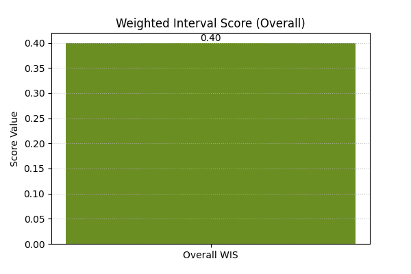
weighted_interval_score
- API Reference:
Concept: Weighted Interval Score (WIS) (Non-Time-Weighted)
WIS is a proper scoring rule for evaluating probabilistic forecasts provided as a median and a set of central prediction intervals. It generalizes the absolute error and considers multiple quantile levels, balancing sharpness (interval width) and calibration (coverage of multiple intervals). This version calculates an average score over all provided time steps and samples, without explicit time-weighting.
Where \(m\) is the median forecast, and \(\mathrm{IS}_{\alpha_k}\) is the interval score for the k-th prediction interval \((l_k, u_k)\) with nominal coverage \(1-\alpha_k\). The interval score component is typically:
Lower WIS values indicate better forecast performance.
When to Use: Use WIS when you have probabilistic forecasts in the form of a median and several symmetric prediction intervals (defined by quantiles, leading to \(\alpha_k\) values). It provides a single, comprehensive score that balances the accuracy of the median forecast with the calibration and sharpness of the prediction intervals. It’s a standard metric in challenges like the M5 competition.
Practical Example (Calculation):
 1import numpy as np
 2from fusionlab.metrics import weighted_interval_score
 3
 4y_true_wis = np.array([10, 12, 11])
 5y_median_wis = np.array([10, 12, 11])
 6# For K=2 intervals. y_lower/upper shape: (n_samples, K_intervals)
 7y_lower_wis = np.array([[9, 8], [11, 10], [10, 9]])
 8y_upper_wis = np.array([[11, 12], [13, 14], [12, 13]])
 9alphas_wis = np.array([0.2, 0.5]) # Corresponds to 80% and 50% PIs
10
11score_wis = weighted_interval_score(
12    y_true_wis, y_lower_wis, y_upper_wis, y_median_wis, alphas_wis,
13    verbose=0
14    )
15print(f"WIS: {score_wis:.4f}")
Expected Output (Calculation):
WIS: 0.4000
Visualization:
WIS is typically a single summary score. It can be visualized as a bar chart, especially when comparing different models or segments.
 1import matplotlib.pyplot as plt
 2# Using score_wis from the calculation example above
 3
 4fig_wis, ax_wis = plt.subplots(figsize=(6,4))
 5ax_wis.bar(['Overall WIS'], [score_wis], color='olivedrab', width=0.5)
 6ax_wis.set_title('Weighted Interval Score (Overall)')
 7ax_wis.set_ylabel('Score Value')
 8ax_wis.text(0, score_wis, f'{score_wis:.2f}', ha='center', va='bottom')
 9plt.grid(axis='y', linestyle=':', alpha=0.7)
10# To save for documentation:
11# plt.savefig("docs/source/images/metric_wis_plot.png")
12plt.show()
Expected Plot (Overall WIS Bar Chart):
Bar chart showing the overall Weighted Interval Score.