Evaluating and Visualizing Forecasts
Effective evaluation and clear visualization are key to understanding
the performance of your forecasting models and communicating their
results. fusionlab-learn provides utilities in
fusionlab.plot.evaluation to help with this process,
working seamlessly with forecast data structured by
format_predictions_to_dataframe().
This guide demonstrates how to use the primary plotting functions:
plot_forecast_comparison(): For visualizing actual vs. predicted values, including quantile intervals.plot_metric_over_horizon(): For analyzing how performance metrics change across the forecast horizon.plot_metric_radar(): For comparing a metric across different segments or categories.
Prerequisites
Ensure you have fusionlab-learn and its common dependencies
installed. For visualizations, matplotlib is essential.
pip install fusionlab-learn matplotlib scikit-learn
Common Setup for Examples
The following imports and basic data generation will be used across the examples. We’ll simulate a forecast DataFrame that might be produced after running a model and formatting its output.
 1import numpy as np
 2import pandas as pd
 3import tensorflow as tf # For Tensor type hint if needed
 4import matplotlib.pyplot as plt
 5import os
 6import warnings
 7
 8# FusionLab imports
 9from fusionlab.nn.utils import format_predictions_to_dataframe
10from fusionlab.plot.evaluation import (
11    plot_forecast_comparison,
12    plot_metric_over_horizon,
13    plot_metric_radar
14)
15# For dummy scaler and metrics if needed by plot functions
16from sklearn.preprocessing import StandardScaler
17from sklearn.metrics import mean_absolute_error
18
19# Suppress warnings and TF logs for cleaner output
20warnings.filterwarnings('ignore')
21os.environ['TF_CPP_MIN_LOG_LEVEL'] = '2'
22tf.get_logger().setLevel('ERROR')
23if hasattr(tf, 'autograph'):
24    tf.autograph.set_verbosity(0)
25
26# Directory for saving any output images from this guide
27evaluation_plot_dir = "./evaluation_plots_output"
28os.makedirs(evaluation_plot_dir, exist_ok=True)
29
30print("Libraries imported and setup complete for evaluation plotting.")
31
32# --- Generate Base Dummy Forecast Data ---
33# This data will be used as input to format_predictions_to_dataframe
34# to create the forecast_df for our plotting functions.
35B, H, O_SINGLE, O_MULTI = 10, 6, 1, 2 # Batch, Horizon, OutputDims
36Q_LIST_VIZ = [0.1, 0.5, 0.9]
37N_Q_VIZ = len(Q_LIST_VIZ)
38SAMPLES_VIZ = B # Number of sequences
39
40np.random.seed(42) # For reproducibility
41base_y_true_single = 50 + np.cumsum(
42    np.random.randn(SAMPLES_VIZ, H, O_SINGLE) * 2, axis=1)
43base_preds_point_single = base_y_true_single * \
44    np.random.uniform(0.9, 1.1, size=base_y_true_single.shape) + \
45    np.random.normal(0, 2, size=base_y_true_single.shape)
46
47# For quantile, ensure median is somewhat centered, and bounds span it
48base_preds_q_median = base_y_true_single * \
49    np.random.uniform(0.95, 1.05, size=base_y_true_single.shape) + \
50    np.random.normal(0, 1, size=base_y_true_single.shape)
51interval_spread = np.abs(np.random.normal(2, 1, size=base_y_true_single.shape))
52base_preds_q_lower = base_preds_q_median - interval_spread
53base_preds_q_upper = base_preds_q_median + interval_spread
54
55# Stack quantiles for single output: (Samples, Horizon, NumQuantiles)
56base_preds_quant_single = np.stack([
57    base_preds_q_lower, base_preds_q_median, base_preds_q_upper
58], axis=-1).reshape(SAMPLES_VIZ, H, N_Q_VIZ)
59
60
61# Create a sample forecast_df for point forecasts
62forecast_df_point_viz = format_predictions_to_dataframe(
63    predictions=base_preds_point_single.astype(np.float32),
64    y_true_sequences=base_y_true_single.astype(np.float32),
65    target_name="value",
66    forecast_horizon=H,
67    output_dim=O_SINGLE
68)
69# Add a segment column for radar plot example
70forecast_df_point_viz['category'] = np.random.choice(
71    ['CatA', 'CatB', 'CatC'], size=len(forecast_df_point_viz)
72    )
73# Add spatial columns for spatial plot example
74forecast_df_point_viz['longitude'] = np.tile(
75    np.linspace(110, 111, SAMPLES_VIZ), H)
76forecast_df_point_viz['latitude'] = np.tile(
77    np.linspace(22, 23, SAMPLES_VIZ), H)
78
79
80# Create a sample forecast_df for quantile forecasts
81forecast_df_quant_viz = format_predictions_to_dataframe(
82    predictions=base_preds_quant_single.astype(np.float32),
83    y_true_sequences=base_y_true_single.astype(np.float32),
84    target_name="value",
85    quantiles=Q_LIST_VIZ,
86    forecast_horizon=H,
87    output_dim=O_SINGLE
88)
89forecast_df_quant_viz['category'] = np.random.choice(
90    ['CatX', 'CatY', 'CatZ'], size=len(forecast_df_quant_viz)
91    )
92forecast_df_quant_viz['longitude'] = np.tile(
93    np.linspace(110, 111, SAMPLES_VIZ), H)
94forecast_df_quant_viz['latitude'] = np.tile(
95    np.linspace(22, 23, SAMPLES_VIZ), H)
96
97
98print("Base data and sample DataFrames prepared for plotting examples.")
Expected Output (Common Setup):
Libraries imported and setup complete for evaluation plotting.
Base data and sample DataFrames prepared for plotting examples.
1. Visualizing Forecast Comparisons (plot_forecast_comparison)
- API Reference:
This function is your primary tool for visually comparing model predictions against actual values. It supports both temporal line plots (showing forecasts over the horizon for specific samples) and spatial scatter plots (showing forecast values across geographical coordinates for a specific horizon step).
Key Use Cases:
Temporal Point Forecasts: Plot actual vs. predicted lines for selected time series samples.
Temporal Quantile Forecasts: Plot actuals, the median prediction, and the uncertainty interval (e.g., between 10th and 90th quantiles).
Spatial Forecasts: Visualize predicted values (e.g., median for quantiles) on a map for a specific forecast step.
Example 1.1: Temporal Point Forecast Visualization
 1print("\nPlotting Temporal Point Forecast Comparison...")
 2plot_forecast_comparison(
 3    forecast_df=forecast_df_point_viz,
 4    target_name="value",
 5    kind="temporal",
 6    sample_ids="first_n", # Plot for the first N samples
 7    num_samples=2,        # Plot for 2 samples
 8    max_cols=1,           # Each sample in its own row
 9    figsize_per_subplot=(10, 4),
10    verbose=0
11)
12# To save:
13# fig_path = os.path.join(evaluation_plot_dir, "eval_temporal_point.png")
14# plt.savefig(fig_path) # Call before plt.show() if saving
Expected Plot 1.1:

Line plot showing actual vs. predicted values over the forecast horizon for selected samples (point forecast).
Example 1.2: Temporal Quantile Forecast Visualization
 1print("\nPlotting Temporal Quantile Forecast Comparison...")
 2plot_forecast_comparison(
 3    forecast_df=forecast_df_quant_viz,
 4    target_name="value",
 5    quantiles=Q_LIST_VIZ,
 6    kind="temporal",
 7    sample_ids=[0, 1], # Plot for specific sample_idx 0 and 1
 8    max_cols=2,
 9    figsize_per_subplot=(9, 4.5),
10    verbose=0
11)
12# To save:
13# fig_path = os.path.join(evaluation_plot_dir, "eval_temporal_quantile.png")
14# plt.savefig(fig_path)
Expected Plot 1.2:

Line plot showing actual values, median prediction, and the prediction interval for selected samples (quantile forecast).
- Example 1.3: Spatial Quantile Forecast Visualization
This requires spatial_cols (e.g., ‘longitude’, ‘latitude’) to be present in forecast_df.
 1print("\nPlotting Spatial Quantile Forecast Comparison...")
 2plot_forecast_comparison(
 3    forecast_df=forecast_df_quant_viz,
 4    target_name="value",
 5    quantiles=Q_LIST_VIZ,
 6    kind="spatial",
 7    horizon_steps=1, # Visualize the first step of the horizon
 8    spatial_cols=['longitude', 'latitude'],
 9    figsize_per_subplot=(7, 6), # Single plot, so this is figure size
10    verbose=0
11)
12# To save:
13# fig_path = os.path.join(evaluation_plot_dir, "eval_spatial_quantile.png")
14# plt.savefig(fig_path)
Expected Plot 1.3:
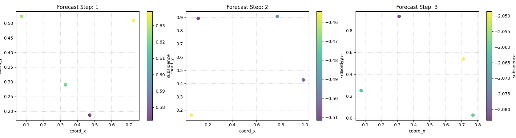
Scatter plot showing the median predicted values across spatial coordinates for a specific forecast horizon step.
2. Visualizing Metrics Over the Forecast Horizon (plot_metric_over_horizon)
- API Reference:
This function helps understand how a model’s performance, measured by one or more metrics, changes as the forecast lead time increases. It’s useful for identifying if a model’s accuracy degrades significantly for longer horizons.
Key Use Cases:
Plotting MAE, RMSE, MAPE, etc., for each step of the horizon.
For quantile forecasts, plotting coverage or pinball loss over the horizon.
Comparing horizon-wise metrics across different segments if group_by_cols is used.
Example 2.1: MAE of Point Forecasts Over Horizon
 1print("\nPlotting MAE of Point Forecast Over Horizon...")
 2plot_metric_over_horizon(
 3    forecast_df=forecast_df_point_viz,
 4    target_name="value",
 5    metrics='mae', # Calculate Mean Absolute Error
 6    plot_kind='bar', # Display as a bar chart
 7    figsize_per_subplot=(8, 5),
 8    verbose=0
 9)
10# To save:
11# fig_path = os.path.join(evaluation_plot_dir, "eval_moh_mae_point.png")
12# plt.savefig(fig_path)
Expected Plot 2.1:

Bar chart showing Mean Absolute Error for each step of the forecast horizon.
Example 2.2: Coverage of Quantile Forecasts Over Horizon (Grouped)
 1# Ensure coverage_score is available for this example
 2
 3print("\nPlotting Coverage of Quantile Forecast Over Horizon (Grouped)...")
 4plot_metric_over_horizon(
 5     forecast_df=forecast_df_quant_viz,
 6     target_name="value",
 7     metrics='coverage',
 8     quantiles=Q_LIST_VIZ, # Required for coverage
 9     group_by_cols=['category'], # Show coverage per category
10     plot_kind='line',
11     figsize_per_subplot=(9, 5),
12     verbose=0
13)
14 # To save:
15 # fig_path = os.path.join(evaluation_plot_dir, "eval_moh_coverage_quant.png")
16 # plt.savefig(fig_path)
Expected Plot 2.2:
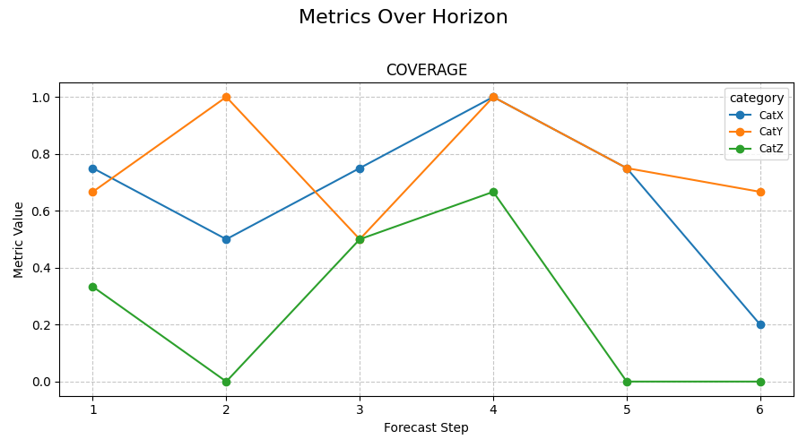
Line plot showing prediction interval coverage for each forecast step, potentially with separate lines for different categories.
3. Visualizing Metrics Across Segments with Radar Plots (plot_metric_radar)
- API Reference:
Radar charts provide a way to compare a single performance metric across different categorical segments (e.g., item types, regions, months). Each segment forms an axis on the radar, and the metric’s value for that segment is plotted along it.
Key Use Cases:
Comparing model performance (e.g., MAE, RMSE) across different product categories.
Identifying if a model performs consistently across different days of the week or months.
Example 3.1: MAE of Median Forecast by Category (Radar Plot)
 1print("\nPlotting MAE by Category (Radar Plot)...")
 2# Using forecast_df_quant_viz which has a 'category' column
 3plot_metric_radar(
 4    forecast_df=forecast_df_quant_viz,
 5    segment_col='category', # Column defining the radar axes
 6    metric='mae',
 7    target_name="value",
 8    quantiles=Q_LIST_VIZ, # MAE will be on the median
 9    figsize=(7, 7),
10    verbose=0
11)
12# To save:
13# fig_path = os.path.join(evaluation_plot_dir, "eval_radar_mae_category.png")
14# plt.savefig(fig_path)
Expected Plot 3.1:
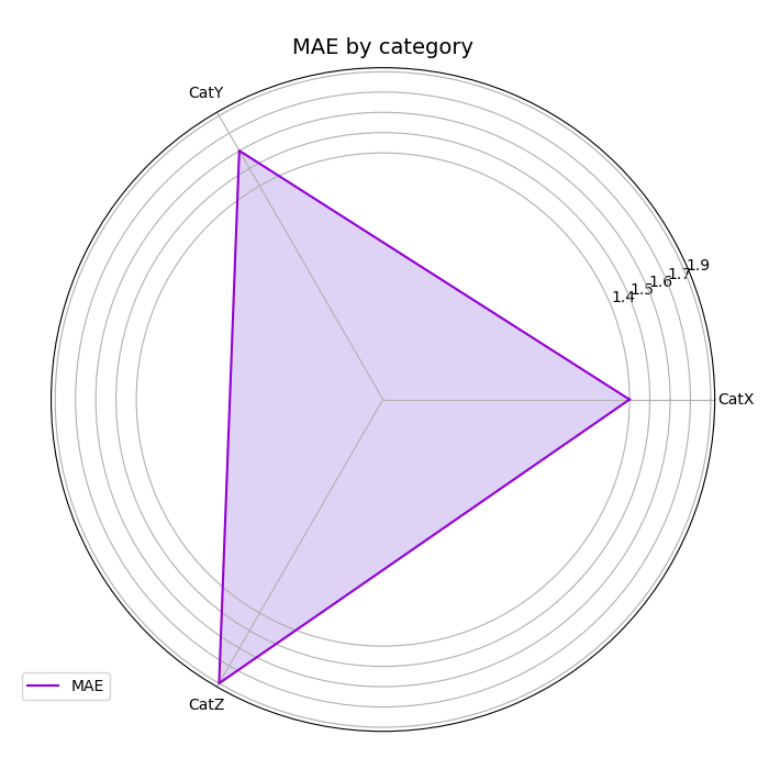
Radar chart showing the Mean Absolute Error (of the median forecast) for different categories.
Further Exploration
These examples provide a starting point for visualizing your
fusionlab-learn model outputs. For a detailed understanding of
the metrics themselves, including their mathematical formulations and
calculation examples, please refer to the Metrics for Forecasting Evaluation page.
Experiment with different parameters of these plotting functions to customize the visualizations for your specific analysis needs.